The Hidden Power of Colors: How They Shape Our Perception of Time
Though we may not realize it in our daily lives, colors can profoundly influence our feelings about the passage of time. In this article, we explore the surprising effects of colors on our time perception and how we can utilize this knowledge.
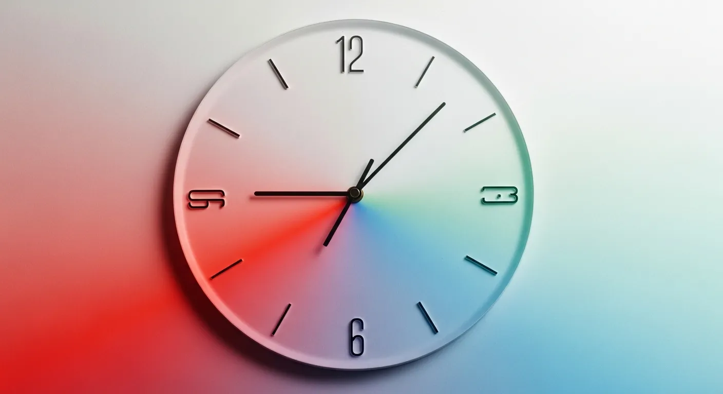
Have you ever felt time slow down amidst the orange hues of a sunset, or an urgent moment stretch endlessly under red lights? Colors don't just offer a visual feast; they also profoundly influence our subconscious feelings about the passage of time. This effect manifests in many areas, from psychology to marketing, architecture to personal productivity. In this article, you will discover the fascinating impact of colors on time perception, the scientific reasons behind it, and how you can use this knowledge in your daily life.
The Fundamental Impact of Colors on Time Perception
Colors are light waves that reach the brain through our eyes, and these waves create different responses in our minds. Time perception is one of these responses. As a general rule, warm colors evoke a feeling that time passes more quickly, while cool colors create the sensation that it passes more slowly.
Warm Colors and Accelerated Time
Warm colors like red, orange, and yellow are generally associated with energy, movement, and urgency. Physiologically, these colors can increase heart rate, raise blood pressure, and elevate the brain's arousal level. High arousal can direct your attention outwards and cause you to process events around you more quickly. This situation creates the perception that time is flowing faster or that an activity is ending more quickly.
- Red: Danger, passion, urgency, energy. Used in restaurants as an appetite stimulant and to encourage quick consumption. People in red rooms may report that time passes more quickly.
- Yellow: Joy, energy, attention-grabbing. Often seen in fast-food restaurants and warning signs. It is common for time spent in a yellow environment to feel shorter.
- Orange: Enthusiasm, warmth, creativity. Can encourage consumers to make quick decisions.
Cool Colors and Decelerated Time
Cool colors like blue, green, and purple are generally associated with calmness, peace, and serenity. Physiologically, these colors tend to lower heart rate and blood pressure, leading the brain to operate at a lower arousal level. Low arousal can make a person feel more relaxed, perceiving time more slowly and in detail. Therefore, cool colors can create the perception that waiting times feel longer.
- Blue: Peace, trust, serenity. Used in hospitals, waiting rooms, and bedrooms for a calming effect. Time spent in a blue environment has been observed to feel longer.
- Green: Nature, renewal, balance. Has a stress-reducing and relaxing effect. Can create a broad and peaceful perception of time.
- Purple: Luxury, wisdom, creativity. Has both a calming and thought-provoking effect.
Scientific Mechanisms: Why Does This Happen?
Behind the effect of colors on time perception lie both physiological and psychological factors:
- Physiological Responses: Colors can affect our autonomous nervous system. For example, warm colors like red stimulate the sympathetic nervous system (fight-or-flight response), increasing heart rate and adrenaline levels. This creates a feeling of arousal and acceleration. Cool colors like blue, on the other hand, activate the parasympathetic nervous system (rest-and-digest), providing a sense of relaxation and deceleration.
- Psychological Associations and Connotations: The cultural and personal associations formed with colors also influence our time perception. Since red is often associated with urgency, danger, or energy, environments dominated by this color can create a feeling of needing to finish a task quickly or that time is passing more rapidly. Blue, associated with peace, serenity, and infinity, reinforces the impression that time flows more slowly.
- Perceptual Load: Some theories suggest that warm colors are visually more intense and stimulating, requiring the brain to exert more effort to process them. This 'perceptual load' can also contribute to the feeling that time is passing more quickly.
Practical Applications of Colors Affecting Our Time Perception
These effects of colors on time perception are strategically used in many areas of life. You can turn this knowledge to your advantage:
Work Environments
Color choice is important for tasks requiring productivity and focus. For example, in jobs demanding intense concentration, shades of blue and green can create a calming and non-distracting environment. These colors can help individuals perceive time more slowly, thus allowing them to focus on their tasks for longer periods. In more dynamic and creativity-demanding areas, yellow or orange accents can boost energy levels, accelerating the flow of time and giving the feeling that tasks are completed more quickly. To overcome distractions and strengthen your focus mechanism in your work environment, you can refer to the article The Brain's Focus Mechanism: Scientific Ways to Overcome Distraction.
Retail and Marketing
The color schemes of stores and websites influence customers' shopping experience and the time they spend. Stores aiming for quick turnover (like fast-food restaurants) often use red and yellow tones to encourage customers to order quickly and leave. Luxury brands or relaxation-focused venues, on the other hand, prefer colors like blue and purple to encourage customers to stay longer, relax, and spend more.
Healthcare and Therapy Settings
Hospitals, clinics, and spa centers typically use cool colors to help patients and visitors relax. Shades of blue and green help make waiting times feel more acceptable and reduce overall anxiety levels. This can enable patients to be more patient during their treatment processes.
Home Decor
You can create your desired atmosphere in your living spaces at home by using colors. In the living room, shades of blue and green can create a peaceful and relaxing environment, making time feel like it's flowing more slowly in the evenings. In the kitchen or study, yellow or orange accents can boost energy and motivation, giving the feeling that time is being used more efficiently. To create peaceful and functional living spaces in your home, you can explore decor articles like The Warm Touch of Scandinavian Design: Peace and Functionality in Your Home.
App and Web Design
In digital interfaces, color choice directly impacts user experience. If a user is expected to complete a task quickly (e.g., a payment process), eye-catching and accelerating colors like red or orange can be used. In applications aimed at more exploration and relaxed browsing, shades of blue or green can encourage users to stay on the interface longer.
Effects of Colors on Time Perception: Comparison Table
| Feature / Color Type | Warm Colors (Red, Yellow, Orange) | Cool Colors (Blue, Green, Purple) |
|---|---|---|
| Time Perception | Passes more quickly | Passes more slowly |
| Physiological Effect | Increased arousal, faster heart rate | Calming, slower heart rate |
| Psychological Effect | Energy, urgency, movement, passion | Peace, serenity, trust, relaxation |
| Areas of Use | Fast consumption, warning, sports, energy | Rest, health, education, contemplation |
| Example Environment | Fast-food restaurant, gym | Hospital waiting room, spa, library |
Tips for Using Colors to Manage Time Perception
Now that you understand the power of colors over time perception, how can you apply this knowledge in your own life? Here are a few tips:
- Productivity-Focused Work: For tasks that need to be completed intensely and quickly, add small accents of red or orange to your workspace. This can help boost your energy levels and give you the feeling of finishing tasks faster. However, avoid excessive use of warm colors for tasks requiring long-term concentration, as this can lead to fatigue.
- Relaxation and Peace: In areas where you want to relax at home (bedroom, living room), opt for shades of blue, green, or light purple. These colors provide mental serenity, helping time flow more slowly and enjoyably. This way, you can feel that the moments you dedicate to yourself are more valuable, free from the day's stress. In your quest for mental serenity, in addition to colors, you can also explore different methods like The Quest for Mental Serenity: Silence Therapy and Minimalist Living Guide.
- Waiting Areas: In environments where you are waiting for something (such as a doctor's office, bus stop), if possible, choose areas dominated by cool colors. This can make the waiting time feel shorter.
- Time Management: When using digital timers or calendars, you can use red/orange reminders for tasks that need to be completed quickly, and blue/green tones for projects that require a longer-term or calmer progression.
Colors are much more than simple pigments perceived by our eyes; they are powerful tools that subtly guide our mood, behavior, and even our perception of time. With this awareness, you can enhance your quality of life by choosing the colors around you more carefully, and more easily create the emotional and cognitive states you desire. The mysterious world of colors, as one of life's little secrets, always awaits discovery.
Resources
Frequently Asked Questions
Which colors make time feel like it's passing faster?
Warm colors such as red, yellow, and orange increase arousal, creating a sensation that time is passing more quickly.
Which colors make time feel like it's passing slower?
Cool colors such as blue, green, and purple have a calming effect, giving the impression that time is flowing more slowly.
What is the scientific reason behind colors affecting time perception?
Colors influence our autonomous nervous system, triggering physiological responses like heart rate and adrenaline. Additionally, the cultural and psychological associations of colors also shape our perception of time.
Which colors increase productivity in a work environment?
For tasks requiring intense concentration, shades of blue and green offer a calming environment. For creativity and dynamism, yellow or orange accents can provide energy.
How can I manage time perception in home decor?
In relaxation areas like bedrooms or living rooms, blue and green tones can provide peace and a slower perception of time. In areas where energy is desired, such as the kitchen, you can use yellow or orange accents.
This content was researched and prepared by the İlgi Alanları editorial team and reviewed for accuracy and readability before publication. Information on health, finance and investment topics is general in nature and does not replace professional advice.